
http://garethjthomas.files.wordpress.com/2009/01/yu_thum.jpg
i like the colours and swirls in this one
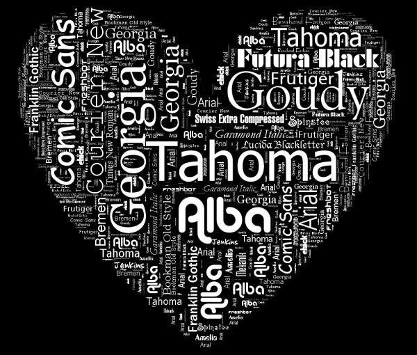
http://www.neoformix.com/2008/TypoDesign1.png
i like this one because it uses the fonts named in it..plus i like the colours
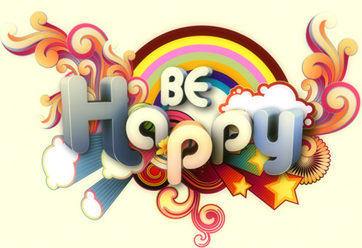
http://creativenerds.co.uk/wp-content/uploads/2009/04/be-happy.jpg
i like this one because its cute, fun, bright colours and has swirls.

http://designerscouch.org.s3.amazonaws.com/design/1252440734_2407_medium.jpg
i like this one because of the colours and the lines

http://th04.deviantart.net/fs36/300W/i/2008/256/6/f/hamburger_by_artcoholicz.jpg
i like this one because its colours, and the words make up the ingredients in the hamburger...

http://sgolubev.com/ljpics/utada-hikaru.jpg
I like this one because it uses a mix of english and japanese text, and the shading of the text for the mouth and neck looks cool.

http://s1.hubimg.com/u/1186468_f496.jpg
i like this one because it is simple but it works ..
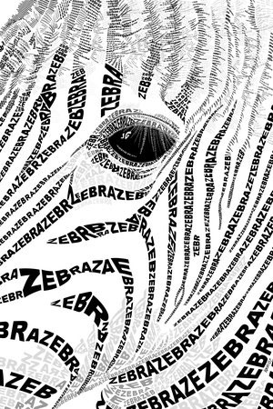
http://www.graphicdesignblog.org/images/typography/typography-19.jpg
i like this one mainly because i like zebras but i like how its not just black and white, there are a few grey bits as well...
http://heartfish.com/wp-content/uploads/2008/09/typewall2.jpg
this one i like because it isnt a 'normal' piece, its solid and something you can touch. i like the curves and stuff...
http://www.youthedesigner.com/wp-content/uploads/2010/03/24-logo-typography.jpg
i like the colours and the smoothness of the letters in this one.
No comments:
Post a Comment