Monday, May 31, 2010

Story with childrens characters

My story, 'Meet the Lollykins' is a simple story aimed at 3 to 5 year olds. The Lollykins are a group of Kindergarten age children (age 4-5) made of lollies. Their dog is made of a carrot- just to throw a healthy spin on the story. The story relates to real life occurrences and emotions in the target audience's life- for example- the routine of going to school, playing, then having tea, bath then bed; and feeling sad when someone you are close to is away for a few hours.

I kept the design of the spreads basic, brightly coloured and relative to each other. I used the same style throughout- everything has a bold black outline (which for a childrens character is good in a marketing sense- eg. colour-in books) and the colours arent confusing (the grass is green, the sky is blue, bricks are brown, etc). I used a sans serif font and large text because it is easy to read. The dimensions are 240mm wide by 300mm high for each page, and 480mm wide by 300mm high for each spread. *after getting the assessment sheet, the size had been changed to A4 for one page, A3 each spread, so i have changed the illustrations to suit this *


MEET THE LOLLYKINS

This is Candy, she is always happy.
This is Fred, he likes to jump around.
This is Na-Na, she likes to dance.
This is Snakey, he likes to play sports.
This is Carrot-Dog, he belongs to Snakey.
Candy, Fred, Na-Na, Snakey and Carrot-Dog live in Lollyville.
Candy, Fred, Na-Na and Snakey are in Kindergarten at Lollyville School.
Carrot-Dog feels sad when Snakey and the Gang are at School.
But after school, all the Lollykins play at the park.
Candy and Fred play hopscotch.
Na-Na dances to her music.
Snakey and Carrot-Dog play with a frizbee.
The Lollykins like to play together and have fun.
Then they all go home and eat their tea.
After a bath, its time for bed.
The Lollykins have had a busy day!

Pages 7 and 8


Pages 11 and 12

Tuesday, May 25, 2010

BSBDES302A-Composites

Composites

1. Heaven

The photograph of the sky and cloud is one i took. I done this composite after i finished the hell composite, so its based on the same idea only opposite- typical heaven objects, bright and light, images of people who are inspirational in good ways.

2. Hell

The photo of the clouds is one i took. The idea behind this composite is to portray what hell might look like- dark and fiery. The images i have incorporated are of people who are hated by MOST people.

3.Harmony

The photo i used that i took was the one of myself. this composite is based on the idea that some music is harmonious to a person and when they listen to it, they feel calm. the musicians pictured are ones that make me calm, also the colours and shapes do too.

4. Dissonance

The photo i used that i took was the one of myself. This composite has the same principles as the harmony composite only reversed. In this one there are musicians pictured that when i hear their music some kind of clash happens in my head or ears and i feel sharp annoyance and anger rather than calm. this is also portrayed in the colours and shapes.

5. Chaos

The photo of my own i have included in this composite is the one of the dog. Whenever i thought of the word chaos i thought of my computer desk at home, which is always messy and houses an assortment of random objects. this is how i chose to do this composite. In the 'chaos room', none of the colours match, there are random objects thrown in, and it is messy. This composite took the longest as it had the most elements in it, but also the easiest because i didnt have to think too hard about what elements to use.

6. Control

The photo of my own which i used is one of the coffee mug on the desk. I went with a similar approach to the chaos composite with this - this room is opposite to the chaos room, it has an obvious (in comparison) sense of control - everything matches, the colours are similar, even the scenery outside the windows is a controlled environment.

Monday, May 24, 2010

serial cut

When i visited this website it was hard to navigate and i wasnt sure exactly what the point of it all was. after i figured out how to browse the images i was fine, although a lot of the images left me wondering 'what the hell was that all about??' even though i did like a lot of the pieces.

as a company i think its a great thing, they are more radical then conventional in their pieces of work. i think their website needs a bit of work to let people who first come to it what its all about and how to navigate. there are some pretty great pieces on the site..here are some of my favorites....


heres my efforts..

Saturday, May 22, 2010

CUFDIG304A-Create visual design components

Finished Body of Work
Logo


Business Card


Letterhead


With Compliments Slip


Bookmark


Outside of Brochure


Inside of Brochure


Report

My logo and stationary set was made for a Debt Collection agency called GMB Debt Collection. The GMB stands for 'Get Money Back', which means it is aimed more towards businesses wanting to get back money which is owed to them. Given this, i went for a professional, serious tone. The research i done on the internet proved a lot of the most professional looking debt collection agencies had the colours blue and grey in their logos. These are the colours i decided to work with. I tried to go with a simple, stark look for my business card, letter head and with compliments slip, and i added more colours and elements to my bookmark and brochure.

At the class critique, before i had even presented my work i realised i needed to make some changes after hearing the feedback and recommendations from the rest of the classes presentations.

With my brochure there were a lot of changes that had to be made. I needed to include headings, take out the page numbers (as it is a four page brochure they werent really needed), the phone numbers on the back page had to be 'squared up' a bit (because the text was centre aligned) and one thing i picked up on was there were too many additional elements, which i would need to cull.

On the business card, my name had to be bigger and the logo smaller. I also needed to include more contact information. With the with compliments slip i needed to rethink the script font of the 'with compliments' as it looked out of place. With the logo, a lot of people thought the curve elements looked a lot like headphones or sound waves, which was unintentional! I was also advised to 'bring it in a bit'- make the logo tighter.

The reconstruction of my stationary set started with the logo. As i was happy with the original one, i changed it to the words and one curve either side, rather than two. This was the logo i used until near the end, when i changed to one curve on an angle and moved the text around. I changed the logo in all the stationary, and re-arranged everything according to suggestions made my the class.

My biggest challenge was the brochure- in the end i changed it about three times before i was happy it met the criteria. I wanted to include the light grey curve element somewhere without making it look too overdone. With the with compliments slip and the letterhead i left this element out because they would be considered official documents they needed to look more 'clinical' than the rest of the stationary.

Tuesday, May 11, 2010

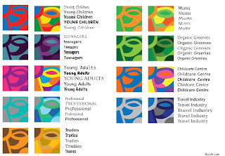
Fruit Juice colours

These are the colours and fonts i picked for a fruit juice company and their selected target audiences.

Photography Assessment - Childhood Toy - Donatello


Urban - 'Railway Dweller'


Black and White - 'Say Cheese!'


Portrait - 'Donatello'


Low Depth of Field - 'Dont mess with the law'


High Depth of Field - 'Havachat'


Night - 'Candle lit hero'


Other #1 'Strong Turtle'


Other #2 'I'll save you Gene!'


Other #3 'Slidey pole'


Other #4 'I did all this with my bare hands'

Saturday, May 8, 2010

Colour Swatches

For this exercise we had to chose a photo we had taken of something natural (not man made) and using the eye dropper tool in whichever program we used, we had to get colours from the photo and make four sets of four colours. We also had to name and take note of the RGB and CMYK for each colour. This is my end result...

Friday, May 7, 2010

Logos for Assessment

Logo for GMB Debt Collection


Business Card


Letter head


With Compliments slip


Bookmark


Brochure
Outside


Inside


Here are all the logos i made to choose from for this assessment

Tuesday, May 4, 2010

Logos..

We were given the task of researching 10 different types of company's logos and seeing what already works for those industries, and making a logo based on this.

Most logos for excavation companies had a picture of an excavator :-) the text was all fairly basic, and colours were simple- mostly black with sometimes some earthy colours like yellow or red thrown in. i decided to keep it simple with one colour for this logo.


the logos for precast concrete were mainly grey and black. some had pictures of cement trucks and some had little square formations as their 'picture'. i chose to go with the cement truck.
After class critique- a few changes


most logos i seen for joineries were in blue, black, grey or brown, with a picture along side the text. the pictures used were houses. saws, trees, wood, and other tools.
After class critique-


the car hire logos i seen online were varied- some had pictures of cars, and some had pictures of the road. colour didnt seem to be an issue with this kind of company, most the logos were one or two colours but the colours used were red, green, yellow, blue and black. some had just the name of the company and no logo.


most of the logos i found had just the name, some had a simple picture of a microscope or similar instrument, and the main colours used were black, grey and blue.


The logos i found for skate shops were all fairly similar- plain text (only slightly stylised) with a picture of a skateboard or a skateboarder, some with a splash of red thrown in. this is what i based my design on.


the italian style cafe's i researched had a lot of different elements betweent them- script font for main title with other text small and plain; a picture of fruit; a picture of coffee; and brown, red or green were the colours mainly used. i tried my hand at a logo with a fruit basket.


The logos i seen online for sex shops were mainly black with the odd bit of red or pink thrown in. some of the pictures they had were silhouettes, lips and hearts. i tried to do something different by putting it all into a box, i didnt see any like that.


The logos i seen for watch and clock shops were elegant and fancy, but some weren't, they had a script font with clock part graphics, like mine.


The musical instrument logos i found online were mainly black and some had pictures of musical instruments, and this is where the idea for this logo came from.