Friday, June 24, 2011
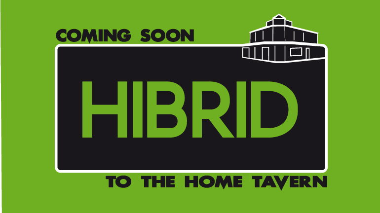
BSBDES401A - The Design Solution.
These are the two ideas i developed - the first is my favorite. I have tried both in different colour schemes and all ive tried work well.


BSBDES401A- Generating ideas
Idea #1-Bold and simple, incorporating the Home Tavern into the border around the band's name. I originally wanted the band's name to be 3D but when i tried it, it didnt look as good as id hoped.

Idea # 2- having an old school style poster 'stuck' onto a brick wall. i never got around to developing this one, but jules had a similar idea and developed hers.

Idea # 3- This is meant to have a happy, summery, retro feel to it. Again, once developed, looked better 2D than 3D


Idea # 2- having an old school style poster 'stuck' onto a brick wall. i never got around to developing this one, but jules had a similar idea and developed hers.

Idea # 3- This is meant to have a happy, summery, retro feel to it. Again, once developed, looked better 2D than 3D

Thursday, June 23, 2011
BSBDES401A- Undertaking research to inform the design solution
There was only one other establishment i could think of that had a similar setup to what Trevor wanted with his television graphics, and that is at the Narrandera Exservices Club. The graphics they have on their screens advertise more than just entertainment (because their establishment obviously would offer more than Trevor's would, being a Club), and its quite obvious it is a Powerpoint presentation. All their slides are very basic and most have scrolling text. Here are some photos of some of the slides taken on my phone:


BSBDES401A- Defining the design challenge
The first meeting that Jules and I had with Trevor Jones, our client, we were well prepared for. Jules and I had discussed questions we were going to ask before the meeting, and we prepared ourselves with everything to take notes. Trevor was prepared, and he knew vaguely what he wanted- he knew the product he wanted, but he didnt know exactly how he wanted it to look only that he wanted it to look good. I believe i acted in a professional manner and the need for me to be firm never arose. I didnt feel intimidated by Trevor, and im sure he wasnt intimidated by me at all.
BSBDES401A- Water Bottle design rationale and feedback summary
For my final design i decided to go with a bold and simple design with a bold and simple statement. I had a lot of trouble with the placement of the type but after getting some help it worked out ok. I wanted a modern approach so i used a sans serif typeface. The feedback i recieved at the end of the project was the type i used for the main focal point may have been too bold. The colours i chose because blue is generally associated with water and black and white go well together and with any other colour. experimenting with the placement of the colours didnt work too well- the one with the white background didnt look quite right. Some feedback i recieved about the bottle 'I' was that people would more likely associate it with a Coke bottle because it has a slight curve in it. the conclusion of my feedback was that although it does look good, the type may have been too bold which is why it has more function than form.
BSBDES401A- Generate Design Solutions- Water Bottle Project Roughs
First ideas


sketch of final design

early versions


sketch of final design

early versions


NSWTGDES501A Research and experiment with techniques to develop typography
Part 2: Documentation rationale
Modern: This cover can be classed as modern because it has clean, sharp lines; use of 3D elements; uses an modern sans serif typeface and has a neutral colour scheme, all of which is evident in modern design. One other colour (red- symbolic in the book) is added for the elements to stand out and be different.


Monotone: This design is monotonic in two ways- it portrays only one theme of the story (shame) and has a colour theme that is monotone- shades of one colour. The type lacks variety in its style.
Passive: This cover is passive because the text isn't overbearing at all. In terms of form v's function this is definately more function than form. the colours, where they don't directly relate to the book, they are a shade of the red which is a symbol in the book. The type used doesnt make the viewer feel anything.
Retro: This cover is retro style because the colour scheme, repetition of circles and type is similar to what was used in design in the 1940's-1970's (which is when the retro era is classed as). The type has a retro feel by being sans serif with a funky twist to it. the colour scheme and large 'A' are based on themes in the story.
Aggressive: This cover is aggressive by having bold, angry text and colours. The elements are all trying to fight for your attention at the same time.
Classic: As this book was set in the 1700's i based my design around the style of design that was popular then. Serif fonts were used then, which is why i have used the type i have. This cover is made to look like a hard cover book without its dustjacket, complete with texture and embossed type. The dividers inconspicuously incorporate the 'A' symbol from the book.
Dynamic: the elements used on this cover (type, shapes and colour scheme) all have a fast moving, energetic feel to them. These include diagonal lines, elements changing from one colour to another quickly, changing from smooth to sharp elements quickly and 'the' and 'letter' font looks like it has been made with a brush, which indicates movement in the design process.
Futuristic: this cover utilises futuristic design styles of smooth shapes and neutral, bold colours. The type is smooth in shape, made to look smooth in texture and is neutral and bold. The 'A' is symbolic of the meteor in the book.
Grungy: This cover is based on a Grunge music style album cover - 'Ten' by Pearl Jam. It has similar elements including textured background, hand images (which is also symbolic of the mother and daughter in the book) and the font is similar in that it is sans serif and bold.
Part 3: class exercises
Link to 10 Type Treatments
Thursday, June 16, 2011
Critical Analysis - questions on critiques
What is the purpose of a critique?
A critique is given so that a designer can get design related opinions about their design, by other designers. This is so they can improve their designs and future designs.
What steps would you take to begin critiquing a design?
First you would ask yourself what you liked about the design, what you didnt like about the design, what the design reminded you of, and how you can tell the designer all this without hurting their feelings.
How do you minimise the risk of offending a designer when critiquing their work?
You do this by keeping your comments factual about the design; not offering suggestions on how to change the design but ways to improve it; and being extra extra polite and sensitive.
As a designer, what are the benefits of being able to accept critiquing of your work?
The benefits are you can see where your going wrong- if you keep doing the same bad stuff without it being critiqued- how are you to know it is bad? critiques help you to do more of the good stuff and less of the bad stuff... because you soon learn what is good and bad.
Friday, June 3, 2011
Articles...
Portfolio Design 101
- Remember quality not quantity with portfolio- quality work, quality folder, quality boards. Custom made folders are recommended.
- Good number of works is 12-15, but no more than 20.
- Keep graphic design stuff in one portfolio, and fine art/illustration in another.
- 3 types of portfolio- traditional, online and PDF
- Know yourself- who you are, how you were raised and what you experience in your life influence your designs.
- Take risks.
- being friendly, honest, punctual, polite, and professional will set you apart from everyone else. Offer a higher level of service to your clients than everyone else does.
- When you do get to the top there may be a cost involved. Other people may be jealous of your success and try run you down, but this is their problem not yours.
- Honesty with yourself is an integral part of self promotion.
- Dig deep and be honest, rather than using shallow, fancy designs which may not really be what you are intending to show off for self promotion.
- Personality filter- may be wise to leave out negative aspects and focus on the positive.
- Viewers of your work look at it and feel they know your personality from your work.
- Tasks that can be boring or overwhelming can lead to wanting to do something else to avoid getting it done.
- Instead of looking at the project as a whole (which can be overwhelming) break it up into smaller, managable chunks/goals that are easily achieved.
- Often smaller jobs that you need to ask help for will prevent you from being able to continue with a bigger job.
- Best thing to overcome these problems is to be strict with yourself, and reward yourself for when you accomplish goals you have set.
BSBDES501A- Implement Design Solutions
BSBDES501A- Implement Design Solutions - Nicole Walsh
Winter in Wagga Wagga report.
1. Research for this project could be undertaken by searching the internet, or in person. On the internet, you could go to the Wagga council website and the various websites that are linked; or other websites promoting Wagga, like the ones through New South Wales Tourism. These websites promote many things to do in Wagga at all times of they year- its just a matter of picking out what there is to do in the Winter months. In person would involve going to places like the council chambers and visitor information centre. At these places you can ask people about information regarding what areas you wish to cover.
2. I decided on an A4 page that is folded twice to end up as a DL size brochure. I chose this medium because it is practical, is versatile as far as storage and distribution are concerned and has the right amount of room for information and images- not enough to overwhelm but more than enough to bore the reader.
3. Resources i will need are paper sizes, printing templates, information and images.
4. factors which may impact on selection of resources can be image size and resolution, copyright on images, and reliability of information source.
5. Feedback has been positive so far- my logo had a few things that needed to be fixed up originally but with input from teacher and classmates is now fine.
6. The benefits of this process are that i could see the designs progress from its first stages- which will be useful in the future for saving time when i get similar ideas, i know what will work and what wont work.
7. My promotional piece will assist in increasing tourism numbers by showcasing the exciting things Wagga has to offer in Winter.
8. I could encourage a budget increase by pointing out the fact if there was more money spent on printing the brochures, the quantity would be higher, therefore could be distributed in more places and more people are likely to see it and visit Wagga.
9. The best way to present my design concept to my client would be to give them a print out of the brochure. Also a mockup with photos of the brochures in places where they would be on display- eg, in tourist information centres, on counters in shops, etc.
Printing quotes.
Whirlwindprint.com :
6PP DL roll
150gsm
gloss finish
full colour
QTY 5000
$974.16
Heroprint.com.au :
6PP DL roll
150gsm
gloss finish
full colour
QTY 5000
$584 (including delivery)


Thursday, June 2, 2011
ICPPP224B: Produce pages using a page layout application
ICPPP224B- Produce pages using a page layout. Nicole Walsh


pg 2

pg 3

pg 4

pg 5

pg 6

pg 7

back cover
Rationale:
1. You wound need to ask the client to specify the style they want- for this particular project, Salvador Dali has a few different styles of work and the client may need to specify which particular movement they wanted the booklet to follow.
2. You could save wasting time by getting as much information out of the client as you can when you brief them at the beginning. By chosing colours, images, styles and possibly fonts they like, this would save them wanting you to change things later on.
3. Research for this project would be taken out by searching online or in books for Salvador Dali and his artworks. Being the famous artist and eccentric person he was, there is a lot to be found. The things you could search for include artworks, involvement in different art movements, quotes, political statements, biographies, museums and exhibitions.
4. Suggestions i would offer: be more specific with what information they wanted in the booklet- if they want a biographical approach or more of a factual account of the artist’s paintings. - Specify a budget they are planning on sticking to. -Specify their choice of stock, and weather they would like the cover a different stock to the rest of the booklet.
5. Limitations you would come across would most likely just be with the images- getting big enough images to be of print resolution may be an issue if you are sourcing images from the internet. Also copyright could be an issue in some cases.
6. Setting the document up in InDesign allows you to place elements and still have the option of editing them in other programs, without too much drama. You can also have styles set for paragraphs, characters and objects which can be edited to suit the style of the document. The text options are good also- including placement of text boxes and text wrap.
7. For the printer i have chosen, www.readysteadyprint.com.au, i will need to set up my file as CMYK, have already spell checked the text, fold and crop marks are clearly specified, at least 2mm bleed and fonts need to be supplied or converted to curves/ outlines. Issues which may uccur could be placing the pages in the wrong order and they will end up printing wrong. other problems might arise if there are any steps left out of the preflight checklist which may prolong printing due to errors with colours, fonts or images.
Printing Quotes
Whirlwind Print (www.whirlwindprint.com)
150 gsm
matt finish
QTY 1000
$1432.08
Specs: Has to be PDF; 5mm internal and 5mm external bleed on booklets; 300 DPI; CMYK; clear but short file names (eg NL_BOOK.PDF); colour maximum 300% for coated stock, 260% for uncoated stock; outline or embed fonts.
Ready Steady Print (www.readysteadyprint.com.au)
150 gsm
matt finish
QTY 1000
$1071.00
Specs: Do spellcheck; has to be correct size for product ordered; CMYK; 2mm bleed on all edges; text to be outlined or made into curves.
I would chose to go with Ready Steady Print because they are cheaper. Although Whirlwind are more specific with their requirements, they are not instantly recognisable as an Australian company like Ready Steady Print is, which i feel is important.

front cover

pg 2

pg 3

pg 4

pg 5

pg 6

pg 7

back cover
Rationale:
1. You wound need to ask the client to specify the style they want- for this particular project, Salvador Dali has a few different styles of work and the client may need to specify which particular movement they wanted the booklet to follow.
2. You could save wasting time by getting as much information out of the client as you can when you brief them at the beginning. By chosing colours, images, styles and possibly fonts they like, this would save them wanting you to change things later on.
3. Research for this project would be taken out by searching online or in books for Salvador Dali and his artworks. Being the famous artist and eccentric person he was, there is a lot to be found. The things you could search for include artworks, involvement in different art movements, quotes, political statements, biographies, museums and exhibitions.
4. Suggestions i would offer: be more specific with what information they wanted in the booklet- if they want a biographical approach or more of a factual account of the artist’s paintings. - Specify a budget they are planning on sticking to. -Specify their choice of stock, and weather they would like the cover a different stock to the rest of the booklet.
5. Limitations you would come across would most likely just be with the images- getting big enough images to be of print resolution may be an issue if you are sourcing images from the internet. Also copyright could be an issue in some cases.
6. Setting the document up in InDesign allows you to place elements and still have the option of editing them in other programs, without too much drama. You can also have styles set for paragraphs, characters and objects which can be edited to suit the style of the document. The text options are good also- including placement of text boxes and text wrap.
7. For the printer i have chosen, www.readysteadyprint.com.au, i will need to set up my file as CMYK, have already spell checked the text, fold and crop marks are clearly specified, at least 2mm bleed and fonts need to be supplied or converted to curves/ outlines. Issues which may uccur could be placing the pages in the wrong order and they will end up printing wrong. other problems might arise if there are any steps left out of the preflight checklist which may prolong printing due to errors with colours, fonts or images.
Printing Quotes
Whirlwind Print (www.whirlwindprint.com)
150 gsm
matt finish
QTY 1000
$1432.08
Specs: Has to be PDF; 5mm internal and 5mm external bleed on booklets; 300 DPI; CMYK; clear but short file names (eg NL_BOOK.PDF); colour maximum 300% for coated stock, 260% for uncoated stock; outline or embed fonts.
Ready Steady Print (www.readysteadyprint.com.au)
150 gsm
matt finish
QTY 1000
$1071.00
Specs: Do spellcheck; has to be correct size for product ordered; CMYK; 2mm bleed on all edges; text to be outlined or made into curves.
I would chose to go with Ready Steady Print because they are cheaper. Although Whirlwind are more specific with their requirements, they are not instantly recognisable as an Australian company like Ready Steady Print is, which i feel is important.
Wednesday, June 1, 2011
The Squad , Percept , Rising Sun Pictures
Percept
Percept is a Graphic Design agency that have been operating in Sydney, NSW, Australia since 1997. They were formally known as Eye Scream Graphic Design.
The services they offer can be divided into the following categories: Branding, internet, print and marketing. Branding includes corporate identity, rebranding, and brand naming. Internet includes web design, web hosting and email advertising. Print includes designs, stationary, digital and offset printing, photography and visual communication aids. Marketing includes advertising, collateral design and electronic marketing.
Percept are recognised by a number of jobs such as the Packaging Design community with features in the Dieline, Packaging of the World and Labels Plus, and the Email Marketing community as featured in the Campaign Monitor Gallery and as well as winning an Inbox Award.
Percept have represented in the prestigious Desktop Create Design Awards. They have been twice honoured in the 36th Annual Creativity Awards. Percept has published 42 design projects in various international graphic design journals.
Percept have featured in Oz Graphic and the Desktop Design Directory, the publications featuring Australia’s top design studios.
Percept were Wine label design medallists at Printing Industries Craftsmanship Awards. They are also an active member of AGDA (Australia Graphic Design Association).
Subscribe to:
Posts (Atom)