Saturday, May 22, 2010

CUFDIG304A-Create visual design components

Finished Body of Work
Logo


Business Card


Letterhead


With Compliments Slip


Bookmark


Outside of Brochure


Inside of Brochure


Report

My logo and stationary set was made for a Debt Collection agency called GMB Debt Collection. The GMB stands for 'Get Money Back', which means it is aimed more towards businesses wanting to get back money which is owed to them. Given this, i went for a professional, serious tone. The research i done on the internet proved a lot of the most professional looking debt collection agencies had the colours blue and grey in their logos. These are the colours i decided to work with. I tried to go with a simple, stark look for my business card, letter head and with compliments slip, and i added more colours and elements to my bookmark and brochure.

At the class critique, before i had even presented my work i realised i needed to make some changes after hearing the feedback and recommendations from the rest of the classes presentations.

With my brochure there were a lot of changes that had to be made. I needed to include headings, take out the page numbers (as it is a four page brochure they werent really needed), the phone numbers on the back page had to be 'squared up' a bit (because the text was centre aligned) and one thing i picked up on was there were too many additional elements, which i would need to cull.

On the business card, my name had to be bigger and the logo smaller. I also needed to include more contact information. With the with compliments slip i needed to rethink the script font of the 'with compliments' as it looked out of place. With the logo, a lot of people thought the curve elements looked a lot like headphones or sound waves, which was unintentional! I was also advised to 'bring it in a bit'- make the logo tighter.

The reconstruction of my stationary set started with the logo. As i was happy with the original one, i changed it to the words and one curve either side, rather than two. This was the logo i used until near the end, when i changed to one curve on an angle and moved the text around. I changed the logo in all the stationary, and re-arranged everything according to suggestions made my the class.

My biggest challenge was the brochure- in the end i changed it about three times before i was happy it met the criteria. I wanted to include the light grey curve element somewhere without making it look too overdone. With the with compliments slip and the letterhead i left this element out because they would be considered official documents they needed to look more 'clinical' than the rest of the stationary.
Tuesday, May 11, 2010

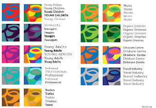
Fruit Juice colours

These are the colours and fonts i picked for a fruit juice company and their selected target audiences.

Photography Assessment - Childhood Toy - Donatello


Urban - 'Railway Dweller'


Black and White - 'Say Cheese!'


Portrait - 'Donatello'


Low Depth of Field - 'Dont mess with the law'


High Depth of Field - 'Havachat'


Night - 'Candle lit hero'


Other #1 'Strong Turtle'


Other #2 'I'll save you Gene!'


Other #3 'Slidey pole'


Other #4 'I did all this with my bare hands'

Saturday, May 8, 2010

Colour Swatches

For this exercise we had to chose a photo we had taken of something natural (not man made) and using the eye dropper tool in whichever program we used, we had to get colours from the photo and make four sets of four colours. We also had to name and take note of the RGB and CMYK for each colour. This is my end result...

Friday, May 7, 2010

Logos for Assessment

Logo for GMB Debt Collection


Business Card


Letter head


With Compliments slip


Bookmark


Brochure
Outside


Inside


Here are all the logos i made to choose from for this assessment

Tuesday, May 4, 2010

Logos..

We were given the task of researching 10 different types of company's logos and seeing what already works for those industries, and making a logo based on this.

Most logos for excavation companies had a picture of an excavator :-) the text was all fairly basic, and colours were simple- mostly black with sometimes some earthy colours like yellow or red thrown in. i decided to keep it simple with one colour for this logo.


the logos for precast concrete were mainly grey and black. some had pictures of cement trucks and some had little square formations as their 'picture'. i chose to go with the cement truck.
After class critique- a few changes


most logos i seen for joineries were in blue, black, grey or brown, with a picture along side the text. the pictures used were houses. saws, trees, wood, and other tools.
After class critique-


the car hire logos i seen online were varied- some had pictures of cars, and some had pictures of the road. colour didnt seem to be an issue with this kind of company, most the logos were one or two colours but the colours used were red, green, yellow, blue and black. some had just the name of the company and no logo.


most of the logos i found had just the name, some had a simple picture of a microscope or similar instrument, and the main colours used were black, grey and blue.


The logos i found for skate shops were all fairly similar- plain text (only slightly stylised) with a picture of a skateboard or a skateboarder, some with a splash of red thrown in. this is what i based my design on.


the italian style cafe's i researched had a lot of different elements betweent them- script font for main title with other text small and plain; a picture of fruit; a picture of coffee; and brown, red or green were the colours mainly used. i tried my hand at a logo with a fruit basket.


The logos i seen online for sex shops were mainly black with the odd bit of red or pink thrown in. some of the pictures they had were silhouettes, lips and hearts. i tried to do something different by putting it all into a box, i didnt see any like that.


The logos i seen for watch and clock shops were elegant and fancy, but some weren't, they had a script font with clock part graphics, like mine.


The musical instrument logos i found online were mainly black and some had pictures of musical instruments, and this is where the idea for this logo came from.

Monday, May 3, 2010

Typography i like...


http://garethjthomas.files.wordpress.com/2009/01/yu_thum.jpg
i like the colours and swirls in this one

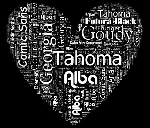
http://www.neoformix.com/2008/TypoDesign1.png
i like this one because it uses the fonts named in it..plus i like the colours


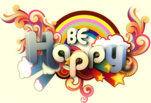
http://creativenerds.co.uk/wp-content/uploads/2009/04/be-happy.jpg
i like this one because its cute, fun, bright colours and has swirls.

http://designerscouch.org.s3.amazonaws.com/design/1252440734_2407_medium.jpg
i like this one because of the colours and the lines

http://th04.deviantart.net/fs36/300W/i/2008/256/6/f/hamburger_by_artcoholicz.jpg
i like this one because its colours, and the words make up the ingredients in the hamburger...


http://sgolubev.com/ljpics/utada-hikaru.jpg
I like this one because it uses a mix of english and japanese text, and the shading of the text for the mouth and neck looks cool.

http://s1.hubimg.com/u/1186468_f496.jpg
i like this one because it is simple but it works ..


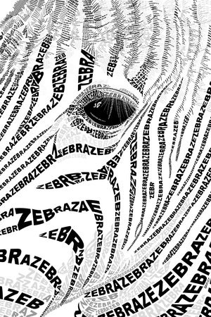
http://www.graphicdesignblog.org/images/typography/typography-19.jpg
i like this one mainly because i like zebras but i like how its not just black and white, there are a few grey bits as well...


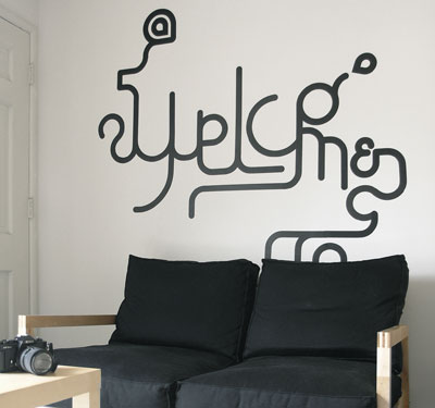
http://heartfish.com/wp-content/uploads/2008/09/typewall2.jpg
this one i like because it isnt a 'normal' piece, its solid and something you can touch. i like the curves and stuff...


http://www.youthedesigner.com/wp-content/uploads/2010/03/24-logo-typography.jpg
i like the colours and the smoothness of the letters in this one.