Tuesday, May 11, 2010

Photography Assessment - Childhood Toy - Donatello


Urban - 'Railway Dweller'


Black and White - 'Say Cheese!'


Portrait - 'Donatello'


Low Depth of Field - 'Dont mess with the law'


High Depth of Field - 'Havachat'


Night - 'Candle lit hero'


Other #1 'Strong Turtle'


Other #2 'I'll save you Gene!'


Other #3 'Slidey pole'


Other #4 'I did all this with my bare hands'

Saturday, May 8, 2010

Colour Swatches

For this exercise we had to chose a photo we had taken of something natural (not man made) and using the eye dropper tool in whichever program we used, we had to get colours from the photo and make four sets of four colours. We also had to name and take note of the RGB and CMYK for each colour. This is my end result...

Friday, May 7, 2010

Logos for Assessment

Logo for GMB Debt Collection


Business Card


Letter head


With Compliments slip


Bookmark


Brochure
Outside


Inside


Here are all the logos i made to choose from for this assessment

Tuesday, May 4, 2010

Logos..

We were given the task of researching 10 different types of company's logos and seeing what already works for those industries, and making a logo based on this.

Most logos for excavation companies had a picture of an excavator :-) the text was all fairly basic, and colours were simple- mostly black with sometimes some earthy colours like yellow or red thrown in. i decided to keep it simple with one colour for this logo.


the logos for precast concrete were mainly grey and black. some had pictures of cement trucks and some had little square formations as their 'picture'. i chose to go with the cement truck.
After class critique- a few changes


most logos i seen for joineries were in blue, black, grey or brown, with a picture along side the text. the pictures used were houses. saws, trees, wood, and other tools.
After class critique-


the car hire logos i seen online were varied- some had pictures of cars, and some had pictures of the road. colour didnt seem to be an issue with this kind of company, most the logos were one or two colours but the colours used were red, green, yellow, blue and black. some had just the name of the company and no logo.


most of the logos i found had just the name, some had a simple picture of a microscope or similar instrument, and the main colours used were black, grey and blue.


The logos i found for skate shops were all fairly similar- plain text (only slightly stylised) with a picture of a skateboard or a skateboarder, some with a splash of red thrown in. this is what i based my design on.


the italian style cafe's i researched had a lot of different elements betweent them- script font for main title with other text small and plain; a picture of fruit; a picture of coffee; and brown, red or green were the colours mainly used. i tried my hand at a logo with a fruit basket.


The logos i seen online for sex shops were mainly black with the odd bit of red or pink thrown in. some of the pictures they had were silhouettes, lips and hearts. i tried to do something different by putting it all into a box, i didnt see any like that.


The logos i seen for watch and clock shops were elegant and fancy, but some weren't, they had a script font with clock part graphics, like mine.


The musical instrument logos i found online were mainly black and some had pictures of musical instruments, and this is where the idea for this logo came from.

Monday, May 3, 2010

Typography i like...

http://garethjthomas.files.wordpress.com/2009/01/yu_thum.jpg
i like the colours and swirls in this one

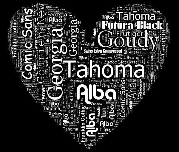
http://www.neoformix.com/2008/TypoDesign1.png
i like this one because it uses the fonts named in it..plus i like the colours


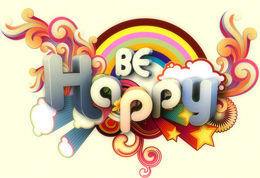
http://creativenerds.co.uk/wp-content/uploads/2009/04/be-happy.jpg
i like this one because its cute, fun, bright colours and has swirls.

http://designerscouch.org.s3.amazonaws.com/design/1252440734_2407_medium.jpg
i like this one because of the colours and the lines

http://th04.deviantart.net/fs36/300W/i/2008/256/6/f/hamburger_by_artcoholicz.jpg
i like this one because its colours, and the words make up the ingredients in the hamburger...


http://sgolubev.com/ljpics/utada-hikaru.jpg
I like this one because it uses a mix of english and japanese text, and the shading of the text for the mouth and neck looks cool.

http://s1.hubimg.com/u/1186468_f496.jpg
i like this one because it is simple but it works ..


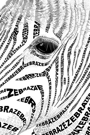
http://www.graphicdesignblog.org/images/typography/typography-19.jpg
i like this one mainly because i like zebras but i like how its not just black and white, there are a few grey bits as well...


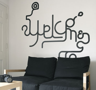
http://heartfish.com/wp-content/uploads/2008/09/typewall2.jpg
this one i like because it isnt a 'normal' piece, its solid and something you can touch. i like the curves and stuff...


http://www.youthedesigner.com/wp-content/uploads/2010/03/24-logo-typography.jpg
i like the colours and the smoothness of the letters in this one.

Thursday, April 29, 2010

Typography Exercise

Today we were given the task of getting 4 pictures and placing a word (which relates to the picture) somewhere in or near the picture.

Wednesday, April 28, 2010

Typography logos

We were given the task of making a logo for ourselves using type. when we had a few ideas we printed them out and the class voted for which 3 we had to develop further. after further developing we had to choose one which we would use for various projects, the first being the model competition flier. here are my first logos...


These are the 3 that the class voted the best and that had been worked a bit more...


And this is the one i picked to use :-)

teen model competition fliers

We were given the task to make a flier for a teen modelling competition to be held in Wagga, using logos we made in a typography lesson. These are the two that i made...


Monday, April 19, 2010

Modern Kraft poster

Today we were given the task of designing a poster for a graphic design conference. we were given the name, what it was, when it was, where it was and the size of the poster. We then had to research other posters of this nature - i found some of them had website information, who was going to be at the confrences speaking, what the topics were that were going to be spoken about, and who was sponsoring the event (I have included some of these in my poster). I also researched the venue which the conference was to be held at, and found a suitable room which the graphic design conference will be held in.
I am very happy with my end result- it came together just as i had pictured it.

Had a bit of time left over so i done the second idea that i had for this poster-


After a class critique it was back to Illustrator to have a bit more of a play with these posters. Here are some variations...


Sunday, April 11, 2010

Just playing around

Some photos ive taken and edited in PSP


Tuesday, March 30, 2010

The Noise music festival posters

Finally i have something to blog about this... i got a bit behind with this task. I had so many ideas that would have looked great for this task but i had difficulty getting it from my head to the computer.
This is the first one i done - looked good in my head but crap when it got to PS.


This one i like - it uses the logo that i like the most and its simple. I thought of putting more things in it but it would have been overkill.