Saturday, February 27, 2010

Photography Exercise


This photo of a weed growing through the pavers was taken on the 'Cuisine' setting of my camera, it was taken outside around midday in the shade. The cuisine setting would have a medium ISO, a low F-stop/big aperture, and a quick shutter speed.
________________________________


This photo of three chairs was taken on the 'Fireworks' setting of my camera, it was taken outside around midday in the shade. The fireworks setting would have an ISO of not quite the lowest but not the highest, a low F-stop/big aperture and a quick shutter speed.
________________________________


This photo of a tafe building was taken on the 'Landscape' setting of my camera, it was taken outside around midday on a sunny day. The landscape setting would have a low ISO, medium F-stop/medium aperture (notice the trees in the background are a bit blurry), and a slow shutter speed (there is a lot of light let in).
________________________________


This photo of Ani and Elise skipping was taken on the 'Sport' setting of my camera, it was taken outside around midday on a sunny day. The sport setting would have a low ISO, high F-stop/small apterture, and a quick shutter speed.
________________________________


This photo of a car wheel was taken on the 'Portrait' setting of my camera, it was taken outside around midday on a sunny day. The portrait setting would have a low ISO, a high F-stop/small aperture, and an average shutter speed (there is not too much or too little light let in).
________________________________


This photo of a light and ceiling was taken with the 'Candle' setting on my camera, it was taken indoors at around 5 pm. The candle setting would have a high ISO, a low F-stop/big aperture, and a medium shutter speed.
________________________________


This photo of a plant in my garden was taken with the 'Cuisine' setting on my camera, it was taken outside at around 5 pm on a cloudy day.The cuisine setting would have a medium ISO, a low F-stop/big aperture, and a quick shutter speed.
________________________


This photo of a garden gnome was taken with the 'Available Light Portrait' setting on my camera, it was taken outside at around 5 pm on a cloudy day. The available light portrait setting would have a low ISO, low F-stop/big aperture, and a medium shutter speed.
________________________________


This photo of a car, lawn and cigarette smoke was taken on the 'Night portrait' setting on my camera, it was taken outside around midnight. the night portrait setting would have a high ISO (there is a little bit of grainy-ness when you zoom into the photo), a medium F-stop/apterture, and a quick shutter speed (this can be seen with the clarity of the smoke and the blurriness of parts of the car).
________________________________


This photo of a lighter was taken on the flower/macro setting on my camera, which on my camera is called close up, or super close up. this was taken with the super close up. It was taken outdoors around 10 am on a cloudy day. this setting would have a low ISO, a low F-stop/big aperture, and a quick shutter speed.

Thursday, February 25, 2010

The grass is always greener....


....on the other side of the fence - which is what i have tried to portray in this composite. I have gone for a more simple, literal approach, which relates to everyday people, situations and lifestyles. On the left hand side is the normal side, where there is a nice normal home; the lawn is nice and tidy, not perfect but still green; a nice, old, faithful dog and a nice, old, faithful wife. There is a lot of love on this side of the fence. On the other side of the fence, however, is a new, fancy house; a dog that is a lot nicer looking; and a hot looking chick in hardly any clothes who is posing on a chair, and lush, green, untidy lawn. There are love hearts on both sides - the ones on the normal side with 'love' written on them show that there is love on that side of the fence, and the ones on the other side of the fence indicate a sense of lust and heartbreak - lust because it is thought to be love but it really isnt; and heartbreak because in the end you will be disappointed that the 'Other Side' isnt what it originally seems, which is what the little devil is put in to portray.
I kinda run out of time so some of the pen tool work on some of the elements is a bit dodgy, but other than that im pretty happy with how it turned out.

Lots of Logos...

Dentist Logos -


These logos work well because they are clean cut and simple, they have teeth on them so it can be easily recognised as a dentist. The use of color is interesting - most of the ones i seen are different shades of blue - i think that would be because a lot of people are scared to go to a dentist so a calming, relaxing colour on the logo of the dentist would make people more comforted than a logo that was red or black.
_________________________________________
Gymnasium Logos -


These logos appear to work because they are bold, show pictures of fit people and also gym equipment, so you know what type of business it is just by looking at the logo.
_____________________________________
Florist Logos -

These logos work because the colours are eye catching, they have the product they sell pictured in the logo somewhere (a flower), they are soft, sweet, fun and simple.

Tuesday, February 23, 2010

Space Composite


Here is my space themed composite done in Photoshop. It was hard to try and lay out all the seperate images and make them look ok... it was easy with the backpack putting the longer objects into it. im not too happy with the tractor, it was originally meant to be smaller but when i made it bigger it went kinda funky-like. I do like the background..that was just having a play with the blur setting. But, overall, im happy with the end result.

Friday, February 19, 2010

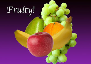
Fruity!


This is an exercise we done in class using Photo Shop - we had to get the pictures off the internet, then using the pen tool go around the edge of each piece , add drop shadows then put in the background and text. i enjoyed it - although at some points it was a bit frustrating remembering which keystrokes were for what... ill eventually get the hang of it though i guess.

Im a Deviant....

We had to create our own Deviantart account for Tafe and I have been adding some of my stuff from home. Check it out HERE ... if your game :-)~

Wednesday, February 17, 2010

Photographers and their photos i like

Edward Steichen
I like the contrast of the dark and light in this photo, and how the outside, the black bits, are not as focused as the centre, the people. i also like the older style of this photo.


Robert Adams
I like the contrast of this photo - how the lights of the machines stand out so much against the black clouds - and the positioning, how the body of the subject is positioned lower so you can see more of the clouds and the sky.


Jeff Wall

I like the clarity and brightness of this photo- and the action shot of the drink spilling. The subject looks a bit paranoid or anxious.

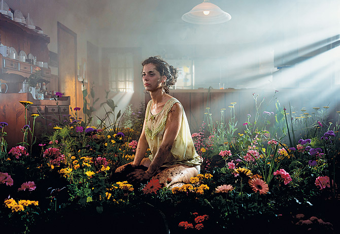
Gregory Crewdson

I like the light shining in on this photo, and the contrast between that and the dark plants,and how the garden is indoors.


Martin Parr

I like this photo because of the fact one of its subjects is anonymous- there is a lady but we dont know what she looks like because the flag is covering her face. i like the focus on the flag, and the bright colours.

Cindy Sherman

I like this photo because the colours of the background are striking.. and the subject of a clown- its meant to be a happy subject but the look on its face isnt very happy at all.


Tony Vaccaro

I like this photo because its subject looks so peaceful and not caring. The contrast with the light and dark is cool.


Richard Billingham

The light in this photo makes all the colors in the background. I like this photo because it captures the subject's personalities.


Larry Clark

I like this photo because the light and darkness work well together, and the subject is kind of wrong.


Araki

I like the busy-ness of this photo, there is a lot to look at. The cat looking at the photo of Yoko is cool, its almost like it is thinking...'umm, thats not Yoko', and it looks like that is what Araki is capturing.

Thursday, February 11, 2010

Played a game today...

Get the Glass! (www.gettheglass.com)

Interesting game. The colours were dark so that made it a bit boring to look at at first, but they served their purpose in relation to the game itself.
The detail in the graphics was good- i especially liked the animated water. The characters and scenery looked like Wallace and Grommit crossed with the Barnyard game for PS2...
The game itself was ok, a bit repetitive with some of the challenges at first, until i got the hang of them. Some were fun, like the one where you have to stop the Mum from getting too angry; and others were crap - the blurry maze with the bucket of water - didnt understand it and my eyes are still recovering.

Tuesday, February 9, 2010

first post

hi... this is the first post of my design blog... seeing if it works... testing one two... lol.